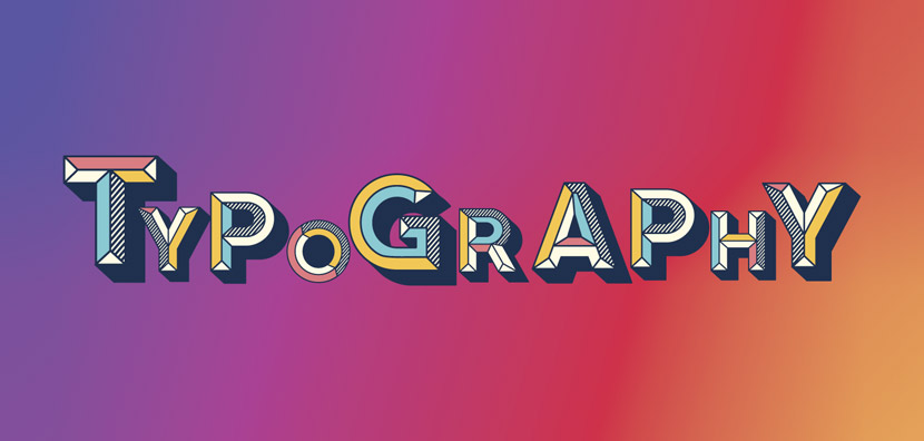
Typography is a cornerstone of visual communication, influencing how content is perceived, read, and understood. At the heart of typography lies the f
Typography is a cornerstone of visual communication, influencing how content is perceived, read, and understood. At the heart of typography lies the font, a critical element that defines the style, readability, and personality of text. Whether you are a designer, marketer, or casual content creator, understanding fonts and their applications is essential for effective communication. This article provides a comprehensive guide to fonts, covering types, uses, design principles, and tips for choosing the perfect font for your projects.
What Is a Font?

A font is a specific style and size of text that determines how letters, numbers, and symbols appear on a page or screen. While often used interchangeably with “typeface,” technically, a typeface is the overall design, while a font is a particular implementation of that design (including size, weight, and style).
Fonts play a crucial role in conveying tone and enhancing readability. For example, a professional report may use a serif font like Times New Roman, while a creative poster might use a bold, playful sans-serif font.
Types of Fonts
There are several categories of fonts, each with unique characteristics and applications:
1. Serif Fonts
- Characterized by small lines or strokes at the ends of letters
- Convey tradition, reliability, and formality
- Commonly used in books, newspapers, and official documents
- Examples: Times New Roman, Georgia, Garamond
2. Sans-Serif Fonts
- Clean and modern without decorative strokes
- Ideal for digital content due to clarity on screens
- Convey simplicity, modernity, and professionalism
- Examples: Arial, Helvetica, Calibri
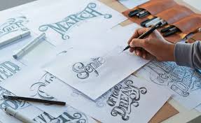
3. Script Fonts
- Mimic handwriting or calligraphy
- Often used for invitations, logos, or creative designs
- Convey elegance, sophistication, or playfulness
- Examples: Brush Script, Pacifico, Lobster
4. Display Fonts
- Highly stylized fonts designed for attention-grabbing headlines
- Not recommended for body text due to readability issues
- Examples: Impact, Comic Sans, Bebas Neue
5. Monospaced Fonts
- Each character takes up the same horizontal space
- Commonly used in coding, technical documents, and typewriters
- Examples: Courier New, Consolas, Monaco
Why Fonts Matter
Fonts do more than just display text—they impact readability, aesthetics, and user experience. Some key reasons fonts matter include:
1. Readability
Choosing the right font ensures your audience can read your content easily. Poor font choices can strain the eyes and reduce comprehension.
2. Brand Identity
Fonts help communicate a brand’s personality. For example, luxury brands often use elegant serif fonts, while tech startups may favor modern sans-serif options.
3. Tone and Emotion
Different fonts evoke different emotions. Script fonts may feel personal and intimate, while bold display fonts convey excitement or urgency.
4. User Experience
Web and mobile interfaces rely heavily on fonts for usability. Legible fonts improve navigation, engagement, and overall experience.
How to Choose the Right Font

Selecting the right font involves several considerations:
1. Purpose and Context
- Determine whether the font is for print, web, branding, or decorative purposes
- Match the font style to the tone and audience of the project
2. Readability
- Ensure the font is legible at various sizes
- Consider spacing, weight, and contrast
3. Compatibility
- Use fonts that render well across different devices, browsers, and operating systems
- Web-safe fonts include Arial, Verdana, and Georgia
4. Pairing Fonts
- Combining fonts can enhance design, but avoid using too many
- Common pairing strategies: serif + sans-serif, script + sans-serif
5. Licensing
- Ensure you have the proper license for commercial use
- Free fonts like Google Fonts provide a wide selection for digital projects
Popular Font Tools and Resources
Several tools and platforms help designers and creators work effectively with fonts:
1. Google Fonts
- Free, web-friendly fonts
- Easy integration into websites and projects
2. Adobe Fonts
- Extensive library for Adobe Creative Cloud users
- Offers premium fonts for professional projects
3. Font Squirrel
- Free fonts with commercial licenses
- Helpful for designers on a budget
4. DaFont
- Popular for decorative and themed fonts
- Offers downloadable fonts for personal and commercial use
5. Font Pairing Tools
- Tools like Fontjoy and Canva Font Combinations help find harmonious font pairs for design projects
Tips for Effective Font Usage
Maximizing the impact of your fonts requires attention to detail and design principles:
1. Limit Font Variety
- Stick to 2–3 fonts per project to maintain a clean and professional look
2. Use Hierarchy
- Differentiate headings, subheadings, and body text with size, weight, or style
3. Consider Accessibility
- Ensure fonts are readable for all users, including those with visual impairments
- Avoid overly decorative fonts for large blocks of text
4. Mind Line Spacing
- Adequate line height improves readability and reduces eye strain
5. Test Across Mediums
- Fonts may look different on screen vs. print
- Preview your design on multiple devices and formats
Common Font Mistakes to Avoid
Even experienced designers can make font-related mistakes. Here are some to watch out for:
- Using too many fonts: Creates visual clutter and reduces readability
- Poor font pairing: Clashing styles can confuse the audience
- Ignoring licensing: Using fonts without proper permission can lead to legal issues
- Overlooking readability: Decorative fonts may look attractive but harm legibility
- Neglecting consistency: Changing fonts unnecessarily can break brand identity
Fonts in the Digital Age
The digital era has transformed how we use and think about fonts:
- Responsive typography: Fonts must adapt to different screen sizes
- Variable fonts: Allow dynamic adjustment of weight, width, and style in a single font file
- Web fonts: Optimized for faster loading and better readability online
- Brand-specific fonts: Companies like Apple and Google have proprietary fonts to reinforce identity
Fonts are no longer just aesthetic choices—they are integral to user experience, branding, and accessibility.
Conclusion
A font is more than just a style of text—it’s a powerful tool that influences readability, emotion, and perception. Whether you are designing a website, crafting a brand identity, or creating printed materials, choosing the right font is essential for effective communication. By understanding font types, applications, and best practices, you can elevate your designs, enhance user experience, and make a lasting impression.
In the modern design and digital landscape, mastering fonts is not optional—it’s a necessity for anyone looking to convey ideas clearly, attractively, and professionally.


COMMENTS